
Close

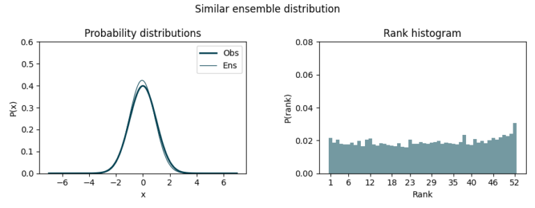
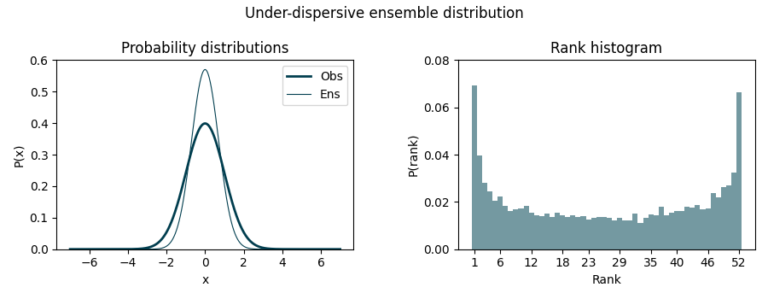
If the ensemble distribution underestimates uncertainty (under-dispersive), we might see a U-shaped histogram since many observations fall outside the predicted range, in the first and last bin.
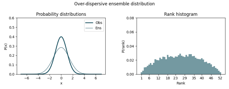
On the other hand, if it overestimates uncertainty (over-dispersive), we’ll observe a dome-shaped histogram as observations concentrate around the middle ranks.
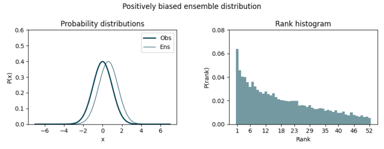
Finally, a biased ensemble distribution lead to asymmetric histograms. In this case, the ensemble tends to predict smaller or bigger values than the observed ones. Negative bias causes observations to cluster towards higher ranks while positive bias does so towards lower ranks.
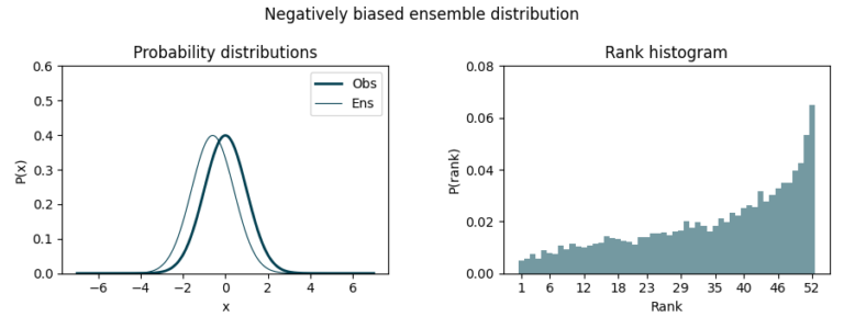
As one can see, this simple yet effective visualization allows us to verify the quality of our forecasts, ensuring whether the members equally represent all the possible scenarios. Besides, they allow us to verify forecasts for grouped periods or locations, as validations in a coordinate-month fashion do not make much sense in seasonal forecasting (unlike, maybe, short-term forecasting).
As we continue to navigate the unpredictable nature of the atmosphere, tools like this will remain invaluable. By embracing the uncertainty and harnessing it, we can make more informed decisions, better prepare for the future, and continue to advance our understanding of the atmospheric system.
Modeled wind resource data for the wind industry.
At any site around the world. Onshore and offshore.