


The annual mean wind speed map is only the cover of the story — it hides how wind behaves in time and how that behaviour itself changes across space.
Wind variability has two dimensions: spatial (how it varies from point to point) and temporal (how it varies over time at a given point).
Temporal variability can be summarised in different complementary ways —f.e. histogram, daily cycle, yearly cycle — each answering a different engineering question.
Two points with the same annual mean wind speed can have opposite daily cycles and opposite seasonal peaks. They are not “the same site, twice.”
Long-term modelled time series now make this level of analysis possible at any prospective site, not only where met masts already exist.
The first thing anyone looks at when assessing a wind resource is the mean wind speed. It’s a useful number, but a dangerous one to stop at: opposite-wind episodes are averaged into a value that never actually occurs at the site. The mean tells you almost nothing about the energy in the wind, the risk in a project, the size of a battery, or the value of a megawatt-hour at 3 pm — all of that lives in the variability around the mean, not in the mean itself.
This article uses a real case: a microscale modelling approach that covers an area of approximately 40 × 45 km in Southeast Asia, providing one year of half-hourly time series at each grid point. It shows several distinct kinds of variability at the same site. This kind of data can now be generated anywhere on the planet — so this analysis is no longer limited to the few sites with long-running met masts.
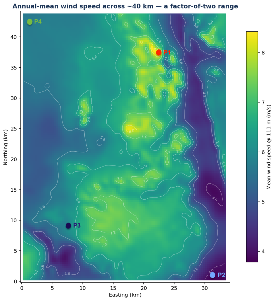
Within this one domain, the annual mean spans more than a factor of two: from under 4 m/s in the sheltered lowlands to 8.4 m/s on the main ridge. Since wind power scales with the cube of speed at moderate winds, a factor of two in speed becomes a factor of several in energy. Siting a turbine on the wrong side of this map is not a small error.
We are familiar with that — this is what wind maps and atlases show.
Stand at a single point on the map rather than averaging it out. Below are two zooms over one year of half-hourly wind speed at a southwest location (P3).
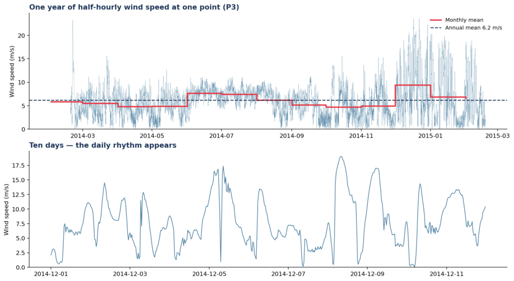
The annual mean — the number the map showed — is the dashed line. The wind is rarely at it. The signal fluctuates across several distinct time scales at once, from diurnal swings to wet/dry seasons, with plenty of structure in between. Zooming into ten days reveals a daily rhythm that the full-year view smears out completely.
A time series is the complete record of temporal variability, but sometimes it’s too much information to read directly — which is why it needs to be compressed. Long, high-resolution records like Vortex TIMES (up to 30 years, 10-minute resolution) are what make the histogram and yearly-cycle summaries below statistically robust rather than a snapshot of one unusual year.
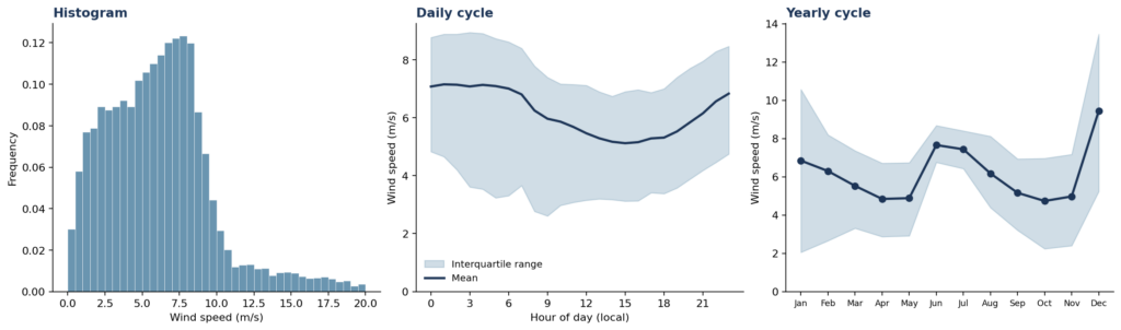
The same year of data, compressed three distinct ways:
Summary | Question it answers | What it’s used for |
Histogram | How often does the wind blow at each speed? | Energy calculations and Weibull curve fits are based on it. Its strength is also its limitation: it deliberately throws away all information about timing. |
Daily cycle | How does mean wind speed change through the day? | Hybridisation with solar/storage, time-of-day price capture. |
Yearly cycle | Which months carry the year? | Seasonal adequacy, portfolio balance, and financing assumptions. |
At this point, the daily cycle peaks in the small hours and sags through the afternoon — a pattern that matters enormously the moment solar, storage, or time-varying prices enter the project. The spread around each mean tells you how confident that average is: a wide band means large variability around that hour or month, and a less representative mean. Isolating this kind of hour-by-hour or season-by-season slice at a specific site is exactly what Vortex BLOCKS is built for — filtering the time series by time of day, season, or atmospheric stability.
The yearly cycle shows the monsoon regime concentrating the resource: December runs at nearly twice the speed of the April minimum, with entire months living in effectively different wind regimes.
None of these three summaries is “the” temporal variability — each isolates a specific question. The spread within each one tells you how representative its average actually is.
A fourth lens worth adding: year-to-year variability. Everything above is drawn from a single year. For project financing (P50/P90 assessments, bankability), the variation between years is just as critical as the variation within a year, and typically requires a longer reanalysis or long-term-corrected dataset to quantify properly.
This is the step that usually gets skipped. Each of the three temporal summaries above can be computed at every point on the map, and each one varies across space as strongly as the mean itself does. Spatial variability is not a property of the mean; it is a property of the wind’s entire behaviour.
Four points span the domain: the windiest ridge cell (P1, 8.4 m/s), the calmest valley cell (P2, 3.8 m/s), a median cell (P3, 6.2 m/s), and a far corner (P4, 5.7 m/s).
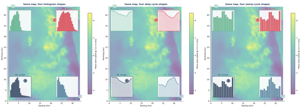
The histograms don’t just slide left or right with the mean — they change shape. The ridge point is broad and near-symmetric (Weibull k ≈ 2.1, 11% of the time below 3 m/s). The valley point, 38 km away, is calm-heavy and long-tailed (k ≈ 1.5), spending 45% of its life below 3 m/s. Two Weibull fits with the same mean would never reveal this — these two points don’t belong to the same distribution family in any practical sense.
The daily cycles aren’t scaled copies of each other either — at P1 and P2 they run in opposite phase. The ridge peaks around 2 am local time and bottoms out mid-afternoon; the valley does the reverse, peaking at 6 pm. Same domain, same overall climate, and one point generates power at night while the other generates it at dusk. For a hybrid wind–solar plant, or a storage-backed PPA, these are not “a windier and a calmer version of the same site” — they are different products with different value profiles.
The yearly cycles split the map a third way. The ridge rides the northeast monsoon and peaks in December; the valley rides the southwest monsoon and peaks in July. P3 and P4 are the sharpest illustration: their annual means differ by less than 0.5 m/s — near-twins on the mean-wind map — yet one peaks in December and the other in July.
Variability is temporal and spatial. A resource assessment that treats “the site” as one point in space and “the wind” as one number in time has averaged away both dimensions of the thing it’s trying to measure.
Spatial variability goes far beyond the mean map. Distribution shape, diurnal phase, and seasonal timing all vary from grid cell to grid cell, sometimes even in complete contrast with each other within the boundaries of a single wind farm. Layout design, turbine choice, and the expected output of each individual turbine all depend on this.
Temporal variability has several faces, and each is the input to a different decision: the histogram feeds the energy integral, the daily cycle feeds hybridisation and price-capture strategy, the yearly cycle feeds seasonal adequacy and portfolio balance. Pick the summary that matches the question you’re actually asking.
This kind of analysis used to be reserved for the rare, well-instrumented site with years of mast data. Modelled long-term time series remove that constraint: every map and inset above comes from a single gridded dataset, and the same views are available for any prospective site. The mean wind speed map is the cover of the book — it’s worth reading the rest.
Want this analysis for your own site? Vortex FARM maps the spatial side across your whole project area with real simulations and gridded histograms; Vortex TIMES and Vortex BLOCKS cover the temporal side, from long-term statistics to hour-by-hour and season-by-season slices. Get in touch with us to see the full breakdown for your prospective location.
Because the mean says nothing about how often extreme highs or lows occur, when they occur during the day or year, or how that pattern differs across even a small site — all of which drive energy yield, project risk, and revenue timing.
to resubmit them manually.
Spatial variability describes how wind statistics change from one location to another across a site or region. Temporal variability describes how wind changes over time at a single location — across hours, days, and seasons. Both matter, and neither can be inferred from the other.
If wind generation peaks at night and solar peaks during the day, the two resources can complement each other well for round-the-clock supply. But if two locations within the same project have wind cycles in opposite phase, they behave as different generation assets, not interchangeable versions of the same site — which affects storage sizing and PPA structuring.
Yes. Two points can share almost identical annual means while having different Weibull shapes, opposite daily cycles, and seasonal peaks six months apart. Judging sites on mean speed alone can miss these differences entirely.
Modeled wind resource data for the wind industry.
At any site around the world. Onshore and offshore.